|
|
Post by alberthorner on Dec 17, 2010 10:08:10 GMT -5
Since I was requested to handle logo ideas please forward all of your suggestions, and or sketchs, to me at albert@pinelandsimagery.com. I don't get much of a chance to get on this forum so emailing your ideas to be will be best.
Albert
|
|
|
|
Post by russ on Dec 17, 2010 13:11:19 GMT -5
Thanks, Al! I'll be sending you something...
|
|
|
|
Post by tneigel on Jan 4, 2011 17:24:03 GMT -5
. Attachments:
|
|
|
|
Post by tneigel on Jan 4, 2011 17:24:21 GMT -5
. Attachments:
|
|
|
|
Post by devilstoy on Jan 4, 2011 19:05:38 GMT -5
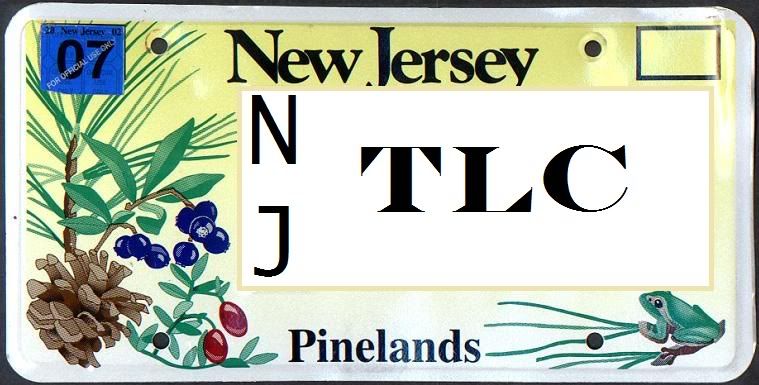
what about one that looks like the pine lands license plate that says njtlc  |
|
|
|
Post by tneigel on Jan 4, 2011 20:02:37 GMT -5
that is a kewl idea.
When we get one settled, I'll make up buttons.
|
|
|
|
Post by devilstoy on Jan 4, 2011 23:22:45 GMT -5
NO GOOD PHOTO SHOP ON MY LAP TOP BUT IF DONE RIGHT I THINK IT COULD LOOK GOOD  |
|
|
|
Post by muck on Jan 7, 2011 10:43:26 GMT -5
My initial thought was a round logo, with radial lines, and in each slice of the "pie" would be the simple sketch for each activity. The simple sketch would be the that of the signs we're used to seeing at trailheads.(jeep, horse, bootprint, etc)
|
|
|
|
Post by tneigel on Jan 7, 2011 12:23:58 GMT -5
I guess we may need graphics help. We have good ideas.
Anybody know of anyone who can help us.
|
|
|
|
Post by daddyz on Jan 7, 2011 19:53:55 GMT -5
I don't know if the pie design will work only for the fact that there are over 10 different activities that our coalition represents. That will leave something/someone out due to space constrictions. We have to remember that whatever we choose will someday be used for silkscreen t-shirts, embroidery on hats and patches, and maybe even jackets. I know this sounds like a dream but it is certainly a possibility. I learned from designing my fishing club's logo that keeping it simple is better. The costs just to transform a design into a file that can be used on wearable items can run into hundreds of dollars. Also, a lot of colors is great but most embroidery machines only sew 6 colors at a time. More than 6 means extra setup on the machine and double the runtime.
I tried to upload a .gif of a sample logo but I need some help on how to add it to the posted message.
|
|
oji
New Member

Posts: 20
|
Post by oji on Jan 7, 2011 20:25:58 GMT -5
The idea that I sent to Al was instead of trying to incorporate all the activities in the emblem it would be easier to use the things they all have in common. N.J., the woods and a trail running through it.
|
|
|
|
Post by HamiltonLJ on Jan 13, 2011 18:37:16 GMT -5
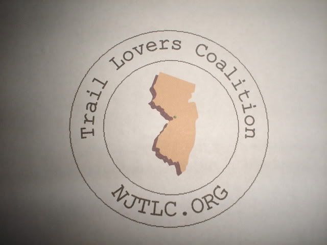
This is the logo I came up with. It will work well on buttons and fit nice in the corner of letterhead.  |
|
|
|
Post by tneigel on Jan 19, 2011 14:56:32 GMT -5
I'll try a few test buttons with this image.
|
|
|
|
Post by muck on Jan 21, 2011 10:33:00 GMT -5
The circular logo looks great. The only input I have is to heavy up the text & circular lines. Personally, I think it needs to be "bolder"
|
|
|
|
Post by HamiltonLJ on Jan 21, 2011 20:40:09 GMT -5
I agree muck! It took me hours to figure out how to curve the lettering. Now I hope someone with more skills can run with it!
|
|