|
|
Post by muck on Jan 24, 2011 9:51:13 GMT -5
I can draw over the letters with a Sharpie....will that do? Seriously, years ago, I made a logo for my old 4x4 club. it was circular. I drew the logo in Autocad & had to locate/turn/rotate each letter. Mybe not the best way, but it worked. I appreciate your hard work.
|
|
|
|
Post by HamiltonLJ on Jan 24, 2011 17:20:24 GMT -5
I never did it before! Now I could do it in minutes!
|
|
|
|
Post by bayberry on Jan 25, 2011 18:28:09 GMT -5
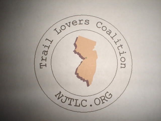
This is the logo I came up with. It will work well on buttons and fit nice in the corner of letterhead.  The circular design works well, and text can be added to one side make a "golden ratio" letterhead / flyer heading. Suggestions: Change the font. I'd look for a non-serif (TNeigel, what you do say?) Look for a different focal . The state outline is not needed, since "NJ" is in the name. I had an idea, but don't have the software to produce it. A one-color stylized pine tree with path curving around it, something like that to suggest "trails" as a focus. I will have my son play with the logo, he has the software and pen tablet, and some graphic design experience. I'll have him bold the lines as suggested, etc. He may also do my suggested graphic so I can show it here. |
|
|
|
Post by tneigel on Mar 15, 2011 11:56:52 GMT -5
test. Attachments:
|
|
|
|
Post by tneigel on Mar 15, 2011 11:58:13 GMT -5
These logo items from our own Albert. Will bring some samples to the meeting. Attachments:
|
|
|
|
Post by tneigel on Mar 15, 2011 11:58:44 GMT -5
. Attachments:
|
|
|
|
Post by tneigel on Mar 15, 2011 11:58:59 GMT -5
. Attachments:
|
|
|
|
Post by tneigel on Mar 15, 2011 11:59:17 GMT -5
5 Attachments:
|
|
|
|
Post by tneigel on Mar 15, 2011 11:59:35 GMT -5
6 Attachments:
|
|
|
|
Post by tneigel on Mar 15, 2011 12:02:36 GMT -5
Now, I'm going to try to put the 2 square ones on buttons, and yet some of the others may be good for banners too. So they all could be great.
Submitted by Albert Horner
|
|
|
|
Post by medfordpiney on Mar 15, 2011 12:14:15 GMT -5
All those logo, besides the first and last give the impression all we are is a hiking group, sort of downplays the involvement of the wheeled and 4 legged riding types...
|
|
|
|
Post by jeepinjp on Mar 15, 2011 12:32:34 GMT -5
All those logo, besides the first and last give the impression all we are is a hiking group, sort of downplays the involvement of the wheeled and 4 legged riding types... I agree and don't think it represents the groups mission |
|
|
|
Post by tneigel on Mar 15, 2011 12:34:35 GMT -5
Great, comments comming in.  Al will appreciate the comments and feedback and thanks again to him for the continued efforts and everyone else. |
|
|
|
Post by jeepinjp on Mar 15, 2011 12:45:06 GMT -5
Like the design though
|
|
|
|
Post by medfordpiney on Mar 15, 2011 13:05:12 GMT -5
|
|